Lol, Thorn, I'm me, not Quartz.
Level select is fine and I actually quite like NA.

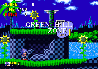
I did abuse this a bit, but after playing around I can see it's problematic. Ultimately, you're limited by the fact that it's grass-shaped (rather than snow-shaped) and that shades of the grass are (it seems) shared by the trees in ways that are unfavourable. Anything I try just plain doesn't work, so I guess it'd be best to leave it as is unless you can find a more clever solution or something.
Robot Factory looks fine so far. Are you going to recolour the pipes as well as the plating?
Catwalk and Final Factory are okay, but they don't get the night-time feeling across like NA does. I think the foreground colours should be darker as they are in NA, as should (possibly) the highlights on the clouds in the background.
As for Starship, I think the blue you left in the pipes should be changed to match the brown.
The other three you posted look pretty solid, though perhaps the contrast of the grass in the AR recolour could be higher (it blend into the background a bit). Part of me wants to say the background of the CP recolour is too garish, but I can see what you're going for with it so it's fine.
Otherwise, just generally, I think more things as a whole need changing that don't seem to have been: some badniks, for instance, are recoloured where others aren't, and Eggman's cape is different whereas the rest of him is the same.
As for RPG's, I think the blue for Lush Hill is a bit too saturated next to the green.

A subtle change, but I think it makes a difference. Possibly change the flowers' default yellow, too.
Neon Fort I think needs changes to the greys in the foreground (especially given what you changed the name to :P), and the shadows on the green Caterkillers should be darkened.
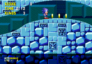
Lost Cavern/Icy Lake I feel needs dulling down above water.

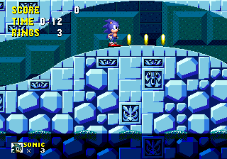
Or maybe this.

Again, subtle, but put them side-by-side and I think you'll see the difference. The underwater pallette is pretty good, though, but perhaps just tone down that one bright blue that's on the top edge of those protruding bits to match the rest of it (I'd do an image but it's such a little thing).
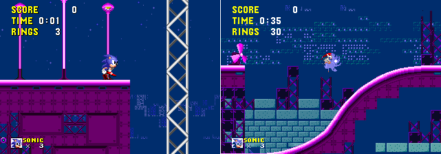
Twilight Coaster is a bit...D: I think it's the sky rather than the pink FG. It just needs to be much darker (I can see it's a bit difficult though since the buildings are the same colour as the sky). When you get lower down things become a bit of a mess, too, what with the ugly green scaffolding and the blocks of black still remaining.

Best I could do, but notice that the windows share some colours with Sonic (visible on the right) which may well make things impossible.
Lava Wotsit looks sweet (though I'm not sure about all the slightly misplaced blocks and objects, but maybe you were going for that on purpose).